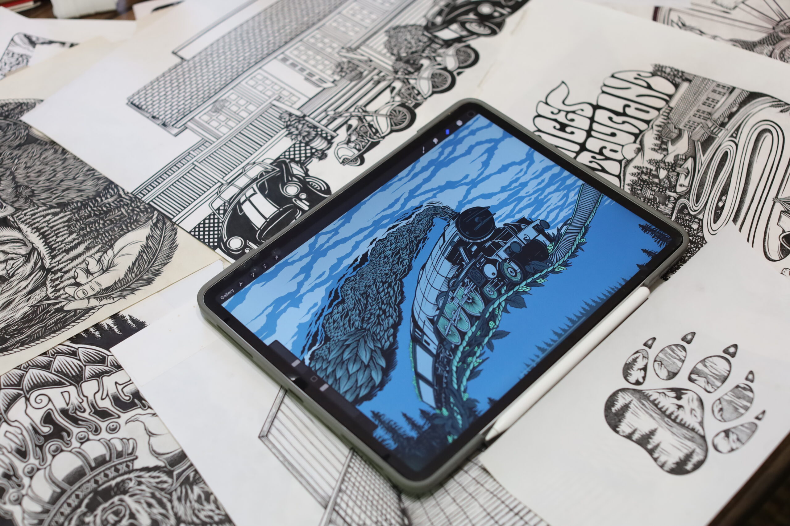
Nestled between the ocean, vibrant strawberry fields, and towering redwoods, Corralitos Brewing Co. is a true hidden gem—a craft beer paradise. With 13 taps and more on the way, we set out to create a custom line of core labels that seamlessly reflected the brewery’s aesthetic, flavor profiles, and brand identity.
Our first project? The award-winning West Coast IPA, Hop Kiss. Through an in-depth creative process, we developed a custom illustration that captured the beer’s essence—its bold name, coastal roots, and the brewery’s signature style. Our strategy focused on vibrant colors, key ingredients, and the breathtaking surroundings that make Corralitos Brewing Co. so special.
Building on the success of the Hop Kiss label, we expanded the designs to the brewery’s entire core lineup, ensuring each beer’s story was brought to life while staying true to the brand’s identity. Designed, labeled, and now proudly distributed across the county—here’s to great beer and even better design. Cheers! 🍻


